CSS pixel 和 Device pixel
- At zoom level 100% one CSS pixel is exactly equal to one device pixel.
screen.width和screen.height得出的尺寸基准是设备像素(device pixel), 这个值就是屏幕的大小.window.innerWidth和window.innerHeight得出的尺寸是浏览器窗口的大小(包含滚动条). 此属性尺寸基准是css像素(css pixel). 放大的时候, 两个值会变小window.pageXOffset和window.pageYOffset代表滚动偏移幅度, 跟滚动条滚动的距离无关. 此属性尺寸基准是css像素(css pixel).dpr=screen.width/window.innerWidth=window.devicePixelRatio
viewport
浏览器中的viewport
- 在浏览器端,
viewport等同于浏览器窗口. 通过document.documentElement的clientWidth和clientHeight获取, 和window.innerWidth区别在于不包含滚动条(测试于chrome浏览器) viewport用来约束html大小- 获取
<html>的尺寸, 通过document.documentElement的offsetWidth和offsetHeight - 在鼠标事件
Event Coordinates中有三个关于事件发生位置的属性pageX/Y、clientX/Y、screenX/Y- pageX/Y gives the coordinates relative to the
<html>element in CSS pixels. - clientX/Y gives the coordinates relative to the viewport in CSS pixels.
- screenX/Y gives the coordinates relative to the screen in device pixels.
- pageX/Y gives the coordinates relative to the
移动端中的viewport
首先请看iphone4到iphone11的尺寸演变THe Ultimate Guide To iphone Resolutions
layout viewport
使用document.documentElement 下面的 clientHeight 和 clientWidth 测量尺寸
visual viewport
使用window.innerWidth和window.innerHeight 测量尺寸
利用视口单位适配页面
仅使用vw作为CSS单位
//iPhone 6尺寸作为设计稿基准
$vw_base: 375;
@function vw($px) {
    @return ($px / 375) * 100vw;
}
@function vw_landscape($px) {
    @return ($px / 375) * 100vh;
}
//使用
@media screen and (orientation: landscape) {
  html {
    font-size: vw_landscape(20);
  }
}使用calc()控制缩放比率
- 假设你要处理下面两种情况: 视口宽度是 400px 时, font-size 是 16px 视口宽度是 800px 时, font-size 是 24px
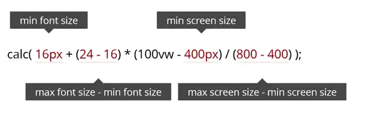
其中100vw是变量, 范围从400px-800px
流式布局Fluid Typography
使用Flexible实现适配: 在<html>元素上增加一个data-dpr属性, 以及一个font-size样式。JS会根据不同的设备添加不同的data-dpr值, 比如说2或者3, 同时会给html加上对应的font-size的值, 比如说75px。 如此一来, 页面中的元素, 都可以通过rem单位来设置。他们会根据html元素的font-size值做相应的计算, 从而实现屏幕的适配效果。
px转rem
横屏适配
contain模式
两种情况
- 内容窗口的宽撑满屏幕 此时屏幕
宽/高比 < 内容窗口的宽/高比 - 内容窗口的高撑满屏幕 此时屏幕
宽/高比 > 内容窗口的宽/高比